We have all had this problem when deciding where to hang a picture especially if you are
unsure about centering it over that radiator which is not in the middle of the
wall or whether you should center it with the wall. The trouble is
that it depends how you look at it –
if you focus on the radiator or the wall, it looks wrong as often
as it looks right.
unsure about centering it over that radiator which is not in the middle of the
wall or whether you should center it with the wall. The trouble is
that it depends how you look at it –
if you focus on the radiator or the wall, it looks wrong as often
as it looks right.
I have lived for some time opposite the shop formerly known
as Ron’s and, when gazing out of
the window in a desultory kind of way, I used to wish sometimes that the word
“Ron’s” had been centred
with the shop front rather than the window but then I looked again and decided
it would be irritating either way. What it cried out for was another word. Ron’s Store maybe, if you wanted to be
sensible but then over the years I wondered more outlandishly. Ron’s World,
Ron’s ‘R Us, Ron’s The Limit,
Ron’s The Man and when the store closed down and remained empty for over a year, I thought it
should read Ron’s Gone.
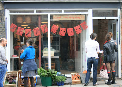
Of course I was thrilled when the old shop was bought and
re-opened as the most perfect of food stores where I can now just cross the
road for fresh bread, milk, eggs, vegetables, cakes, the best espresso coffee
this side of Paradise and even home-made soup and pizza.
re-opened as the most perfect of food stores where I can now just cross the
road for fresh bread, milk, eggs, vegetables, cakes, the best espresso coffee
this side of Paradise and even home-made soup and pizza.
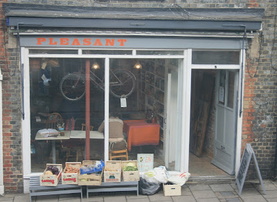
Everything was fine, more than fine, except that signage.
What had been Ron’s was now, well, just a blank painted tastefully grey. Ron’s really
had gone.
What had been Ron’s was now, well, just a blank painted tastefully grey. Ron’s really
had gone.
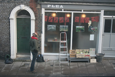
Then one day a man came along with a ladder, a paintbrush
and some cans of paint and the great re-branding began. First with a “P”
– I could hardly contain my excitement. Soon, well not soon actually, the man
was a perfectionist, eventually it had some more letters – “L”
then “E” and then a very attractive “A.” “PLEA” – unusual name I thought
but, hey, let’s not get all conventional about this.
The man, Lewes’ answer to Michelangelo, stood and stared at
his masterwork. Hmm, maybe a few more letters…..maybe centred with the shop
front and not the window? Difficult stuff art.
his masterwork. Hmm, maybe a few more letters…..maybe centred with the shop
front and not the window? Difficult stuff art.
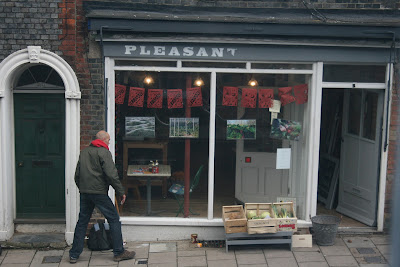
He made his decision and some time later the shop became
‘PLEAS” – well
“PLEA” was rather singular. Would he add an “E”? I wondered
in a state of deep suspense.
‘PLEAS” – well
“PLEA” was rather singular. Would he add an “E”? I wondered
in a state of deep suspense.
No, I was wrong and a day latter, it was all coming clear –
of course “PLEASANT” –
perfect. Michelangelo looked
pleased too.
of course “PLEASANT” –
perfect. Michelangelo looked
pleased too.
As the week progressed I wondered many
imponderables: what the second word was going to be….was there going
to be a second word? Why wasn’t there a second word?
imponderables: what the second word was going to be….was there going
to be a second word? Why wasn’t there a second word?
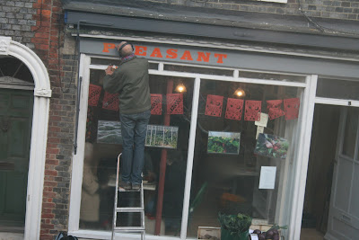
Then the exciting world of colour distracted me as Michelangelo applied a very superior
orange paint to the lettering with delicate precision. This is going to be beautiful, I thought, especially when he returned to the beginning and added another coat.
orange paint to the lettering with delicate precision. This is going to be beautiful, I thought, especially when he returned to the beginning and added another coat.
And it is perfect in its own way.
Oddly named “PLEASANT”
but beautifully painted. It
has looked like this for some time now and, call me neurotic, but that old
feeling has returned. Should it be centred or should it have another word?
Oddly named “PLEASANT”
but beautifully painted. It
has looked like this for some time now and, call me neurotic, but that old
feeling has returned. Should it be centred or should it have another word?
Pleasant what? Pleasant Food, Pleasant Coffee For Hangovers,
Pleasant Company, possibly even
Pleasant Stores.
Pleasant Company, possibly even
Pleasant Stores.
Well, nothing has changed so I thought I would interfere. It
is, after-all, obvious what the other word should be so I painted it in myself.
is, after-all, obvious what the other word should be so I painted it in myself.






I Really agree with you after see this Blog.It is not easy to do.But Lewes has done a good job.
Really a great story. I love and appreciate admin.
So now we can say that business is nothing without a good sign. So for a good sign you can contact Signs company NYC.